
 E-Paper



Your Type by Tanya George: Marketing pun-o-one

 Prefer HTon Google


Hidden shapes, cheeky visuals, clever wordplay. Indian shop signs know how to make you chuckle — and look twice
Puns have long been a go-to technique for logos. How else to cram in layers of information within the tiny space they’re given, and slyly convey what the brand is trying to say? They allow us to treat language not just as a tool, but as a playground. They give us permission to stretch, bend, and twist meaning in joyful ways. I love spotting these signs, which work overtime to create new meaning. Here are some of my favourites.
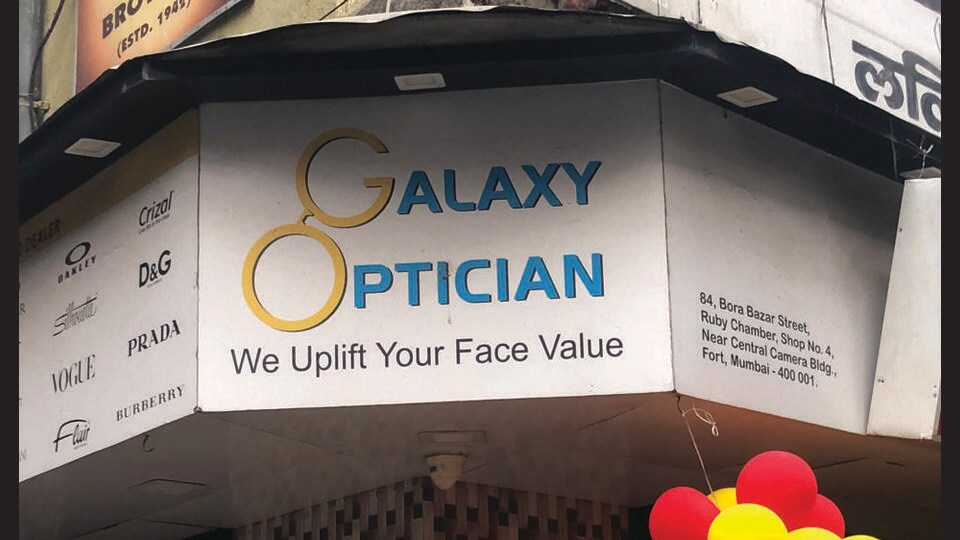
Does this optician’s sign make you grin or groan? I love that someone took the time to position the glasses so cleverly across the two words that make up Galaxy Optician.
Puns were the foundation of early writing systems. Ancient pictograms often stood in for sounds or meanings through association. In medieval Europe, rebus puzzles (images standing in for names or words) found their way onto pub signs, family crests, and coats of arms. These became essential tools for communication, especially in communities with low literacy. And today, rebus-like visual puns still thrive, helping us recognise and remember names even without reading the text.
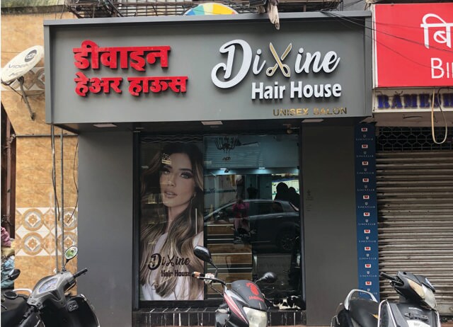
Take the sign for Maqbool Opticians, for instance. They’ve put the two adjacent Os in the name to excellent use. I can just imagine the designer having a great time not only shaping the Os into glasses but also sneaking in a lowercase “a” among all the capital letters. It feels like a subtle, “scientific” nod to the varying letterforms we read in an eye exam.
Visual puns like these are like a brain teaser for the eyes, requiring you to make fast connections between shape, meaning, and often language. It’s linguistic multitasking, condensed into clever, compact forms.
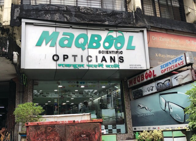
Continuing with the optician theme, here’s another gem: Shirodkar. The unknown designer managed to sneak glasses into the logo not just once, but twice, and across two scripts. In English, the “od” becomes a pair of specs, and again we see a playful use of upper and lower case letters in the design. In the Marathi version, the same shape becomes the letter “Ka”. It’s one design element doing double duty. That’s the kind of ingenuity I find endlessly exciting.
The appeal of a pun, be it verbal or visual, often lies in the unexpected. A sentence sets up one direction and then, BAM! a mini plot twist. Even when they’re silly (and they often are), puns bring people in. They make someone laugh or groan, they spark reactions and conversation. I’m not sure why opticians love them, but they’re not alone. Hair salons seem to be pun-lovers too. Consider Cut The Crap.
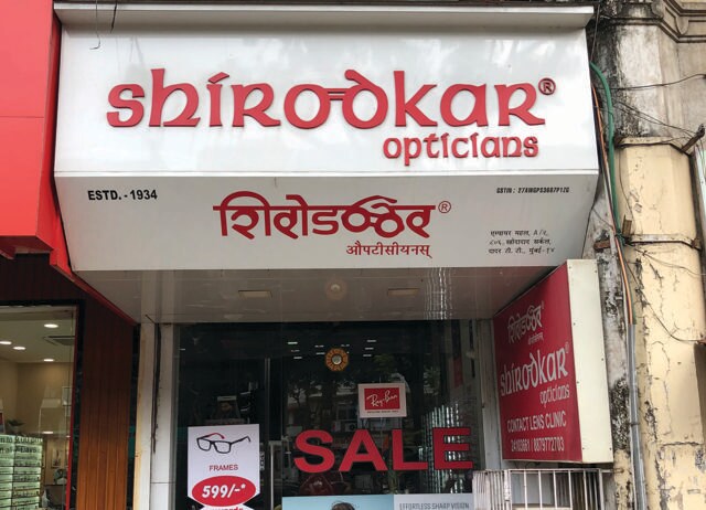
There are quite a few Cut the Crap salons in Mumbai, and I always smile when I see the scissor handle doubling up as the letter “C”. That’s clever branding. And getting this right is an art. You can see a fumble in Divine Hair House. It makes you wonder if the scissors are forming the letter “x” not the “v” in Divine.
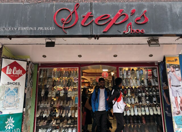
Why should opticians and salons have all the fun? I’ve spotted a shoe shop that sneaks a stiletto into its signage. It’s built right into the letterforms, complete with a white sole for emphasis.
A good pun shows that you’re quick, not just with language, but with timing, structure, and tone. And even a “bad” pun earns (my) respect for the attempt. That’s another reason I love them: Puns are memorable. They stick. And in a road filled with signs, that’s a powerful thing.
From HT Brunch, July 12, 2025
Follow us on www.instagram.com/htbrunch


