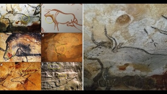
Dots, lines and Y-shaped symbols have been found near the paintings of deer and bison in France’s Lascaux caves. (Images via Wikimedia; Bennett Bacon et al, 2023)
Advertisement
From dots and dashes on cave walls to maps of ocean tides and then the earliest graphs, see how we’ve been visualising data since the start of collective living
If you wanted to know when the bison were returning, and when to expect the next hearty steak, you likely checked the latest cave update, in Ancient Lascaux, France.
For nearly a century, ever since the caves were discovered in 1940, anthropologists have struggled to decode the lines, dots and Y-shaped marks carved into the rock here.
{{^htLoading}} {{/htLoading}}
Now, in a study published last year, researchers from Durham University and University College London, analysed 800 such sequences and found that they
(Wikimedia)
For thousands of years, the cluster of about 34 islands and atolls that make up the Marshall Islands used a sort of nautical map to visualise the complex math of tides, currents and ocean swells.
{{^htLoading}} {{/htLoading}}
Curved bamboo or pandanus root sticks represented ocean swells; straight twigs stood in for currents and waves; seashells were the islands themselves.
“In a coastal environment, these sticks and shells were a practical choice,” says Rajamanickam. “They could weather rain and seawater, and were easy to carry. The Marshallese would study the charts on land before venturing into the sea.”
.
Star maps; China
A representation of the Suzhou star chart from the Song Dynasty, China. (Wikimedia)
In Ancient China, star maps were painted and etched onto the ceilings of tombs, onto stone tablets and onto scrolls, in what were likely attempts to help the dead navigate the heavens.
{{^htLoading}} {{/htLoading}}
These charts were also used to create calendars, predict celestial events such as eclipses and make astrological divinations. They helped in early attempts at astronomy.
A particularly interesting such map is a tomb painting dating to 1116 CE. It shows the Great Bear or Ursa Major constellation, depicted as seven red dots connected by lines. At a distance are nine small discs of varying sizes, believed to indicate the sun, moon and five naked-eye and two invisible planets.
.
Line graph; Scotland
The first-ever line chart. (Wikimedia)
Our modern charts and graphs were born of the great collisions of the 17th and 18th centuries.
{{^htLoading}} {{/htLoading}}
In this Age of Enlightenment, in Europe, England’s Isaac Newton presented his theories on gravity; the Scotsman Adam Smith laid down his economic theory; and the Frenchman Rene Descartes championed curiosity and the act of questioning with the rallying cry: “I think, therefore I am.”
Science, math, philosophy and logical reasoning crashed into each other and took great leaps forward. Amid it all, the foundations of modern graphical representation were laid by William Playfair.
The Scottish engineer and political economist is credited with introducing the line and bar charts to the world.
It makes sense that these took off as they did, amid the excesses of colonialism, when the wealth of nations began to be talked about and compared.
The first-ever bar chart. (Wikimedia)
Back to the early line graph, in 1786, aged just 27, Playfair published what is considered the first such visual representation of a relationship between two or more variables.
{{^htLoading}} {{/htLoading}}
The chart represented the balance of trade between England and Other Nations, using customs data. A wiggly line in orange showed the imports; another in red depicted exports.
The area between them was coloured, to indicate how the balance of trade swung in England’s favour.
In the same year, Playfair published the first bar chart, representing Scotland’s imports and exports to and from 17 countries in 1781. Scotland apparently did brisk trade with Ireland, Russia, America and the West Indies at this time. It exported more than it imported; its biggest customer was Russia.
.
Cholera map; London
By the 19th century, data visualisation had emerged as a tool for analysis and advocacy, says Rajamanickam.
In 1854, physician Dr John Snow mapped the cholera outbreak in London’s Soho area, for instance, to prove the disease wasn’t airborne. Instead, it was traced to that notorious handpump on Broad Street. When the handle of the handpump was removed, the cycle of infection finally broke — and the municipality of London could get down to addressing the root cause: the polluted drinking-water supply at the well..
{{^htLoading}} {{/htLoading}}
Causes of mortality in the army, 1858
(Wikimedia)
We don’t think of nurse and social reformer Florence Nightingale as a statistician, but that was, in fact, a big part of how she drove change.
In 1858, for instance, she created the Diagram of the Causes of Mortality in the Army in the East, which was published as part of a book encapsulating her statistical research.
{{^htLoading}} {{/htLoading}}
Using a three-part coxcomb chart (above), she highlighted how poor sanitary conditions in military hospitals had claimed the lives of more British soldiers than the battles of the Crimean War (1853-56).
A lack of medical supplies and staff support was costing lives too, raising the number of preventable deaths, she argued.
The government accepted and adopted her recommendations on sanitation and war medicine and used her chart, in fact, as the inspiration for the Army Medical Statistics Department, which was set up in the 1860s.
.
As new charts helped us understand our increasingly complex world, “there emerged a growing trust in numbers. And diagrams, maps and charts became an easy way to make sense of the numbers,” Rajamanickam says.
{{^htLoading}} {{/htLoading}}
Visuals, he adds, play on a trait that humans have worked to evolve for millions of years: the ability to spot patterns. “Our species survived because of our ability to spot patterns, and hence, also spot the outlier. It told us: here, something’s amiss. Beware.”
From Covid-19 to economic bubbles, charts now help us do that better, he adds.
All Access. One Subscription.
Get 360° coverage—from daily headlines to 100 year archives.
Sukanya Datta is principal correspondent at HT Wknd, the Sunday features section of Hindustan Times. She writes on science, climate, art, culture, communities and anthropology. Outside the newsroom, she likes to swim, try out Instagram recipes and daydream about her next trip.
Explore the latest Lifestyle News on health, fashion, travel, relationships, food and festivals. Find useful tips, expert advice, trends and inspiring stories for everyday living.
Explore the latest Lifestyle News on health, fashion, travel, relationships, food and festivals. Find useful tips, expert advice, trends and inspiring stories for everyday living.