“Our ocean is changing,” the National Aeronautics and Space Administration (NASA) wrote while posting a visualisation depicting how greenhouse gases impact Earth's water bodies. The space agency wrote that the gases produced by human activities are altering the ocean.
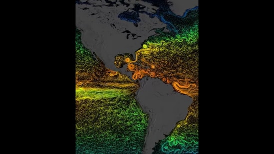
Elaborating on the visualisation, NASA shared that the different colours depict the average temperature for the sea surface currents. “With warmer colours (red, orange, and yellow) representing warmer temperatures and cooler colours (green and blue) representing cooler temperatures,” the agency added.
Also Read: ‘Areas of our planet getting drier’: ESA shares concerning visuals of deserts captured from ISS
“With 70% of the planet covered by water, the seas are important drivers of Earth’s global climate. Yet, increasing greenhouse gases from human activities are altering the ocean before our eyes. NASA and its partners are on a mission to find out more,” NASA further posted.
Take a look at the NASA visualisation here:
Since being shared, the video has received more than 8.2 lakh views. In addition, the video has accumulated nearly 8,000 likes. People posted varied comments while reacting to the share.
What did Instagram users post about this concerning video?
{{/usCountry}}Since being shared, the video has received more than 8.2 lakh views. In addition, the video has accumulated nearly 8,000 likes. People posted varied comments while reacting to the share.
What did Instagram users post about this concerning video?
{{/usCountry}}An Instagram user posted, “Amazing data and visualisation. Very cool!” Adding to the conversation, an individual added, “Climate change is a huge problem”.
A person posted, “Can you please explain what this data is showing? Is it taken over days or months? What time of year? Is it ocean currents or ocean temperatures? What have we concluded from this data?” NASA responded, “The visualisation shows sea surface current flows. The flows are coloured by corresponding sea surface temperature data. The time range for this particular visualisation is from 2007-2008.”
“I could look at this forever," another social media user wrote.
Also Read: In a first, NASA Webb Telescope captures jets of gas from newborn stars. See stellar pic
What are your thoughts on this visualisation by NASA showing the impact of greenhouse gases on oceans?