Sherwin-Williams, a paint titan in the interior design industry has officially released its 2025 Colormix Forecast. This year's selections are a variation of 48 colours condensed into 4 Capsule palettes: Chrysalis, Paradox, Wellspring, and Kindred. The overall theme of the palettes takes inspiration from the simultaneous releases of Barbie (2023) and Oppenheimer (2023) aka Barbenheimer as well as the unexpected red colour theory — both of which focus on an unanticipated bright colour to anchor a room or a corner in your house.
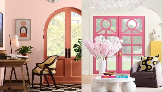
“It’s a little bit of chaos. We’re not looking to anyone for permission on how we use colour anymore. We’re searching for an authentic colour, whether it’s an anchoring dark hue, or a bold, bright pop of colour,” said Sue Wadden, the colour marketing director at Sherwin-Williams to Elle Decor.
Chrysalis: neutrals
The first palette in the capsule focuses on raw and elemental neutrals like sand, cappuccino, moss green, and slate greys. The rustic shades embody a sophisticated, nature-inspired palette that focuses on the conscious use of sustainable materials.
Paradox: dopamine-drenched shades
The next palette plays on the exuberant and unexpected — bright pops of colour that bring joy. The aim of this palette is to induce surprise and delight when you enter a room by amplifying the whimsy and wonder of architecture and design through dopamine-inducing shades like bright pink, lilac, and butter yellow.
{{/usCountry}}The next palette plays on the exuberant and unexpected — bright pops of colour that bring joy. The aim of this palette is to induce surprise and delight when you enter a room by amplifying the whimsy and wonder of architecture and design through dopamine-inducing shades like bright pink, lilac, and butter yellow.
{{/usCountry}}Wellspring: neoclassic royals
The third palette re-imagines the classic by artistically instituting a myriad of powerful shades like bottle green, royal blue, and yellow ochre into modern design; the end goal is to fuse the past with the present, combining yesteryear's reverent shades with today's paint coating technology.
Kindred: warm-hearted colours
A series of easy pastels and other complementary light colours that make you feel good when you enter a room is the theme for the last palette. Maximalist yet collaborative shades are highlighted here; from tomato red to pastel coral and greyish red.
The 2025 Colormix Forecast from Sherwin-Williams embraces an unapologetic approach to colour, encouraging homeowners to explore the chaos within creativity. Who said paint had to be boring?