Choosing colours for your home is not just about creating picking shades that look good individually. The right colour palette can influence how a room feels, bring different elements together and give an interior its own personality. While earthy neutrals such as beige, sand, terracotta and muted olive create a warm, understated atmosphere, bolder shades such as burgundy, deep blue and forest green can bring in depth and character.
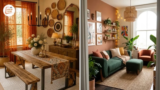
According to Ankit Jain, Founder of Specta Quartz Surfaces, the most interesting interiors often emerge when contrasting palettes are brought together with intention. Rather than treating earthy neutrals and bold colours as alternatives, homeowners can experiment with both to create spaces that feel expressive yet balanced. Here are five ways to create a colour palette using earthy tones and bolder colours.
1. Choose a colour story that reflects the mood you want to create
Before introducing new colours into a room, think about the atmosphere you want to create. Different shades can shape the overall character of a space, so it is important to look beyond personal colour preferences and consider how they work together. Soft beige, sand, terracotta, and muted olive can create a relaxed, grounded atmosphere, making them well suited to spaces designed for unwinding. On the other hand, colours such as burgundy, deep blue, and forest green can give a room a sense of richness and character. You do not necessarily need to use the same colour scheme throughout your home. Instead, aim for a consistent colour story with subtle variations from one room to another. For example, a living room with warm beige and terracotta accents can connect visually with a dining area featuring deeper brown and olive tones.
According to Ankit Jain, Founder of Specta Quartz Surfaces, thinking about how colours work together across the home can help create a more considered interior. The objective is to establish visual continuity without making every room look identical.
2. Experiment with unexpected colour combinations
When it comes to home interior design, colour combinations do not always have to follow conventional pairings. While beige and brown or white and grey are familiar choices for neutral spaces, introducing unexpected shades can make an interior feel more distinctive. Instead of relying exclusively on traditional combinations, experiment with rust and dusty pink, olive green and muted rose, or deep blue with warm beige. These pairings bring together contrasting undertones while maintaining a sense of visual balance.
If you prefer a quieter aesthetic, use a neutral shade as the main colour and add contrast with upholstery, curtains, or a statement piece of furniture. For example, a living room with beige walls and wooden furniture can be enhanced by a deep green accent chair or burgundy cushions. If you enjoy colourful interiors, repeating one or two accent shades across different elements can help create continuity. This keeps the colour palette from feeling disjointed while allowing individual pieces to stand out. The idea is to experiment with contrast while making sure the colours complement, rather than compete with, one another.
3. Let surfaces and finishes influence your colour palette
Colour is not limited to walls, furniture or decorative accessories. The materials and finishes used throughout an interior can influence its entire visual character. Wood brings in natural warmth, metallic finishes add luminosity, while stone surfaces bring depth through their patterns and textures. These materials can also influence which colours work best in a particular space.
According to Ankit Jain, Founder of Specta Quartz Surfaces, innovative engineered quartz surfaces in nature-inspired shades, pastels and earthy textures offer another way to build a distinctive colour palette. Depending on the chosen design, they can complement a restrained interior or provide a contrasting element within a more colourful scheme. You can also experiment with different finishes to introduce depth. Pairing polished surfaces with matte furnishings, or textured stone with smoother materials, can make an interior visually interesting without adding too many colours.
4. Use fabrics and furnishings to introduce colour
One of the easiest ways to experiment with colour is by mixing fabrics and furnishings. Unlike repainting walls or replacing larger furniture pieces, updating soft furnishings lets you explore different palettes without making permanent changes to your interiors. Upholstery and larger furniture pieces can set a room's dominant tones of a room, while curtains, cushions, rugs, and table linen offer opportunities to introduce contrasting shades.
Texture matters just as much when working with fabrics. Pairing velvet cushions with cotton upholstery, woven rugs with smooth furniture finishes, or embroidered textiles with plain curtains can add layers within the same colour scheme. Furnishings can also help connect different shades in a room. For example, a patterned rug with beige, rust and olive can tie together otherwise separate elements such as wooden furniture, neutral upholstery and colourful accessories.
5. Create visual rhythm by repeating colours selectively
A balanced interior gives the eye a sense of continuity. One way to achieve this is by repeating selected colours in different forms throughout a room. For instance, a terracotta cushion could echo the tones in a piece of artwork, a ceramic accessory or a decorative vase. Similarly, brass accents can connect lighting fixtures, decorative objects and tableware. These repetitions help individual elements feel related without requiring exact colour matches.
However, repeating colours does not mean using the same shade everywhere. You can experiment with variations in tone and finish to create a more layered appearance. A room featuring olive green, for example, could incorporate muted green upholstery, darker green accessories and subtle botanical details. As Ankit Jain, Founder of Specta Quartz Surfaces, suggests, bringing contrasting palettes together with intention can help create interiors that feel expressive yet balanced.
How to bring earthy neutrals and bold colours together
Creating a balanced colour palette does not require you to settle on one design approach. Earthy neutrals can provide a versatile foundation, while bolder shades can introduce personality and visual interest. Start by identifying the dominant colours in your existing interiors, including walls, flooring, furniture and surfaces. Once you understand their undertones, you can introduce complementary shades through furnishings, accessories and materials.
If you prefer understated interiors, let neutral shades occupy most of the visual space and use stronger colours selectively. If you enjoy more expressive interiors, experiment with contrasting combinations but repeat a few shades across different elements to maintain continuity. Ultimately, a well-planned colour palette is one that feels cohesive without looking overly coordinated. By paying attention to colour relationships, textures, finishes and proportions, homeowners can create interiors that reflect their individual style while maintaining visual balance.
- How do I choose the right colour palette for my home?
Start by considering the vibe you want to create in your room and the colours already present in your flooring, furniture and finishes. Choose a few complementary shades and build your palette.
- Which colours work best with earthy neutral interiors?
Colour options like beige, terracotta, mauve, etc., suit best.
- How can I introduce bold colours without overwhelming a room?
Use bold colours selectively through cushions, curtains, rugs, accent chairs, artwork and decorative accessories.
At Hindustan Times, we help you stay up-to-date with the latest trends and products. Hindustan Times has an affiliate partnership, so we may get a part of the revenue when you make a purchase. We shall not be liable for any claim under applicable laws, including but not limited to the Consumer Protection Act, 2019, with respect to the products. The products listed in this article are in no particular order of priority.