Trinamool MP Dr Santanu Sen has written to Prime Minister Narendra Modi that the World Health Organization is showing a wrong map of India. "When I clicked the site WHO Covid19.int, a world map was displayed and when I zoomed the portion of India, it was showing a blue map with surprisingly two different colours for Jammu and Kashmir," the MP wrote. He said when he clicked over the blue portion, the map was showing him India's data, but the other portion was showing the data of Pakistan, he said.
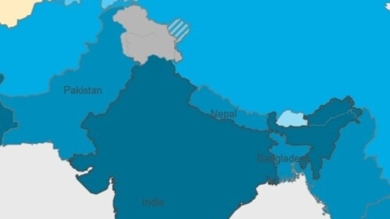
"Moreoever, in our said Indian map, the portion of the state of Arunachal Pradesh is also demarcated separately," the MP wrote.
"I strongly believe that it is a serious international issue and our government should have checked it and taken up the issue much before, being much more vigilant," he added.
The World Health Organization on its homepage has an interactive map of the world which provides the latest global numbers of Covid cases on a daily basis.
{{/usCountry}}The World Health Organization on its homepage has an interactive map of the world which provides the latest global numbers of Covid cases on a daily basis.
{{/usCountry}}The map is a colour-coded map that uses different shades of blue according to the number of total cases. For total cases over 50 lakh, the darkest blue colour is used in the map. Entire India is shown in blue colour while J&k is shown in grey. In the reference chart of the map, it is written that grey stands for not applicable.