Your home shows who you are. It showcases your personality through its interiors, from the colours and textures to the objects you choose to decorate with.ALSO READ: Entryway decor guide: Easy ways to make hallways look stylish and spacious
Colours, especially, play a major role. Describing how beautifully colour personalises spaces, Srikanth SK, head of customer experience at Birla Opus Paints, told us, "Colour has always been woven into the fabric of Indian homes, from our festivals and crafts to the way we personalise our living spaces. What is changing today is the intention behind its use. Homeowners are choosing colours not just to enhance aesthetics, but to create homes that feel comforting, expressive and deeply personal.”
The expert also mentioned how the use of colours is evolving. With dopamine decor in the spotlight, the trend is often associated internally with bold colours and maximalist interiors, but in India, it is more about colours that feel uplifting and soothing.
Living room
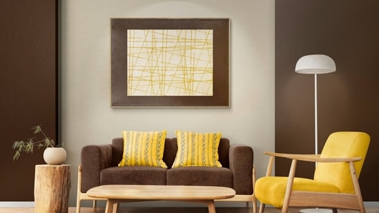
With living rooms being spaces for conversation, the expert suggested warm yellows, such as marigold, for an optimistic, sociable feel. These can be balanced with darker, marble-inspired tones for contrast. The interiors can be layered with handcrafted ceramics, woven textiles, family photographs, and statement lighting. Brown decor items pair well with warm yellow, imparting an earthy touch to the lively space.
{{/usCountry}}With living rooms being spaces for conversation, the expert suggested warm yellows, such as marigold, for an optimistic, sociable feel. These can be balanced with darker, marble-inspired tones for contrast. The interiors can be layered with handcrafted ceramics, woven textiles, family photographs, and statement lighting. Brown decor items pair well with warm yellow, imparting an earthy touch to the lively space.
{{/usCountry}}For balconies, reading corners, foyers, and window seats, Srikanth suggested gentle greens or soft, muted yellow to create a calming, nature-inspired setting. Light neutrals, such as warm off-whites and creamy whites, help the space feel open and uncluttered. Pair with cane furniture, indoor plants, floating shelves, and textured rugs.
In reading corners, foyers, and window seats, use gentle greens or serene yellow shades to evoke calm and mental clarity by strengthening our connection with nature, while soft neutrals like white linen reduce visual clutter and create a sense of openness.
Bedrooms
Since bedrooms are places to rest, the expert recommended muted pastels and soft hues. You can add colours like pale lavender, powder blue, and muted sage to create a relaxing atmosphere. Living rooms can feature brighter colours to complement their lively, social nature; bedrooms, in contrast, need a gentler palette.
Children's room
Children's rooms and study corners should be creative and painted in cheerful colours, such as peach, sky blue, and mint green. When the colours are expressive, they act as a stimulating environment for creativity.