
 E-Paper



Is your home ‘visually noisy’? Know how to use colour theory to transform your interiors

 Prefer HTon Google


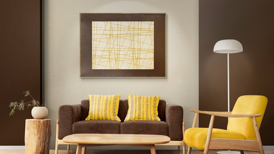
Colour theory for your home: Learn what the best shades are for the bedroom, living room and study.
You may have seen colour theory videos on social media where people hold strips of different colours against their faces to see whether a shade complements them or drains them. Colour theory is a popular way to understand which shade enhances them. In Korea, there are personal colour analysis sessions where experts help pick their ‘best colours.' Many even DIY where they use paint swatches to check which shades flatter them the most.
ALSO READ: Want your home to feel like a warm hug? 6 decor tips to make it cosy
But what if colour theory could also be applied to your home? Colour does not solely influence the appearance of a room. When you look at the bigger picture, it also shapes the mood.
We have asked an expert a few questions on colour theory and how it can be used in interiors. Suumit Arora, founder and CEO of art brand Artiure, shared with HT Lifestyle how you can implement its principles at home.
How can warm and cool colours affect a room?
Let's break down warm and cool colours by examining their undertones. The difference becomes prominent through colour temperature: warm tones lean towards yellow or orange, while cool tones lean towards blue or green.
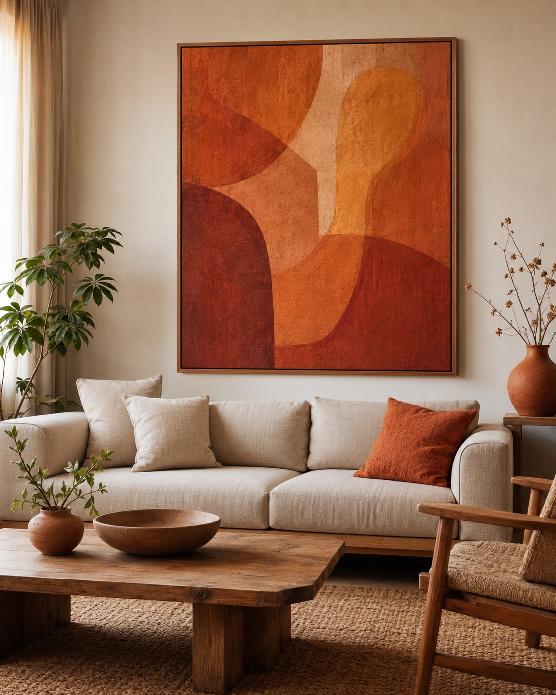
“Warm colours like terracotta, amber, and burnt sienna make a room feel closer. They create intimacy. “Cool colours work in the opposite direction. Slate blue, sage green, muted teal. These expand a room visually and lower its energy," Suumit said.
Warm and cool colours create different effects, influencing how a room feels. If you want a room to appear cosier and smaller, opt for warm tones, while cool colours can make it feel calmer and more spacious.
What is the mistake homeowners are making?
Sometimes, adding too many colours can make a room feel visually overstimulating. However, Suumit clarified that using colour is not inherently wrong, as minimalist, neutral interiors may not be everyone's cup of tea.
The common mistake is actually choosing too many ‘competing shades.’ Describing what ‘colour noise’ looks like, he said, "A living room with a burgundy accent wall, multicoloured cushions, a bright rug, and assorted photo frames in six different tones has no colour story. It has colour noise.” In this scenario, the eyes keep bouncing from one place to another, with no place ‘to rest.’
Can artwork help?
Artwork displayed on the walls also adds colour to a room and is one of the easiest elements to control, especially if you are not planning a complete renovation or repainting the walls. The expert suggested that artwork can help introduce colour more effectively than paint.
“A large abstract in deep indigo above a neutral sofa does something a blue wall cannot. It concentrates the colour. Gives it edges, texture, depth,” he described how art brings harmony in the space.
He also gave a few more examples: "In a large living room that feels hollow, a warm-toned piece of art above the seating area pulls the space inward. A bedroom with a single cool-toned abstract above the headboard reads as calm without being clinical.”
How to create a balanced colour palette?
If the colours in your interiors appear to be discordant, the expert recommended using colour theory to establish a clear visual hierarchy.
"One dominant tone, one or two supporting tones, and a single accent that provides contrast. In practice, this means choosing a piece of art that carries the dominant colour, letting furniture and textiles support it quietly, and allowing one small element, a vase, a throw, a single cushion, to provide the surprise.”
He also pointed out that the same colour can appear different depending on the material on which it is displayed. He said, "The same shade of blue looks different on canvas than on matte paper, and different again on textured cotton rag. An archival print on museum-grade paper holds colour with depth. It shifts as the light changes through the day. A mass-produced poster holds it flatly.”
What are the best colours for different rooms?
Suumit suggested these colours for different rooms:
- Living room: Use warm shades such as terracotta or gold to make the social space more welcoming.
- Bedroom: Go for soft blues or muted greens to create a calm ambience, for better sleep.
- Study: Choose deep navy or forest green, paired with a single warm accent to create a focused space.
- Hallway: Add one confident artwork piece.


