The WNBA's expansion franchise in Cleveland has officially unveiled its identity as the Cleveland Sirens.
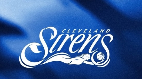
The team's name and branding were revealed during a launch event at Rocket Arena on Tuesday, ahead of the franchise's debut season in 2028 as the league's 16th team.
The unveiling of the Cleveland Sirens is expected to generate even more excitement after the franchise recently surpassed 8,500 season-ticket deposits, despite being nearly two years away from its inaugural season.
Why did Cleveland choose Sirens as team name?
Cleveland was one of the WNBA's original markets when the league launched in 1997, but the Rockers franchise ceased operations in 2003 after owner Gordon Gund was unable to secure a new ownership group.
Because of that history, many supporters expected the revived franchise to bring back the Rockers name that represented the city during its first WNBA era. Instead, the ownership group opted for Sirens.
According to the franchise, the name was chosen to reflect the strength, resilience and unwavering spirit of Northeast Ohio. It also pays tribute to Lake Erie, one of Cleveland's defining landmarks and a source of local pride.
{{/usCountry}}According to the franchise, the name was chosen to reflect the strength, resilience and unwavering spirit of Northeast Ohio. It also pays tribute to Lake Erie, one of Cleveland's defining landmarks and a source of local pride.
{{/usCountry}}"The identity distinctly and authentically represents Cleveland, a city shaped by its lakefront, which serves as the region’s gathering place. The name and brand are a product of a year-long, regionalized, fan-informed process," the team’s statement read.
Inside the team branding: Logo and palette explained
The franchise also highlighted the thought process behind the team's logo, explaining that it incorporates several subtle design elements intended to reflect both the Sirens identity and Cleveland's connection to the water.
"The logo captures the Siren's fluid motion as the character underlines the team's name from beneath the surface, commanding the depths while the tail and basketball crest the waves. The leading "S" in the Cleveland Sirens wordmark conceals "C" (Cleveland), "S" (Sirens) and "CLE" within its form, with its tip curving into a trident. Accent swashes bookend the wordmark, rippling outward like the reverberating sound waves of a siren's call," the team said.
The team explained that its color scheme was intentionally designed to reflect both Cleveland's natural landscape and the city's WNBA history.
"The color palette of Sirens Blue and Erie Blue draws on the hues of Lake Erie and pays homage to the Cleveland Rockers, who competed in the WNBA from 1997 to 2003. A complementary mint foam color adds vibrancy and depth in select applications," Cleveland mentioned.