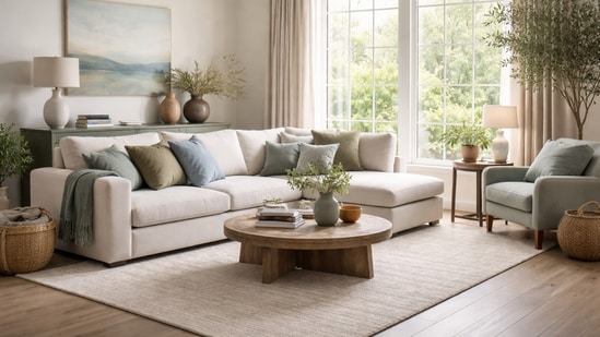
2026 is shaping up to be a year rooted in calm, balance and stability. With several global brands releasing their Colours of the Year, it felt important to look beyond announcements and understand what will truly work inside real homes. The common thread is clear. These choices are driven by long-term appeal rather than momentary buzz. Loud, flashy shades that struggle to settle into everyday spaces are quietly stepping aside.
So, wondering which colour to paint your homes in? Or just looking to decorate a small corner with some updated shades? Here are the top colours that will not only help you stay on trend but also bring in that zen to your spaces in 2026!
From Pantone’s soft Cloud Dancer to Etsy’s Patina Blue, the colours leading 2026 form a thoughtful mix of greys, blues and greens; that promise a sense of timeless comfort that sits well across rooms, moods and lifestyles.
2026 Colours of the year at a glance
| Brand | Colour of the Year 2026 | Colour Family | Key Mood or Idea |
| Pantone | Cloud Dancer | Soft white | Calm, reflection, balance |
| Etsy | Patina Blue | Blue green | Lived in beauty, change |
| James Hardie | Iron Gray | Deep neutral | Structure, strength |
| Benjamin Moore | Silhouette | Espresso charcoal | Classic tailoring |
| Sherwin Williams | Universal Khaki | Beige khaki | Stability, grounding |
| Behr | Hidden Gem | Smoky jade | Statement calm |
| Valspar | Warm Eucalyptus | Green | Restoration, nature |
| Glidden | Warm Mahogany | Deep red brown | Intimacy, warmth |
| C2 Paint | Epernay | Soft ochre | European influence |
| Dulux | Free Groove, Slow Swing, Mellow Flow | Indigo blues | Ease, flow, pause |
Why these colours feel right for 2026
Most of the colours emerging for 2026 share a strong emotional centre. They are rooted in wellness, grounding and a sense of quiet ease, signalling a clear return to colour choices that last rather than short-lived trends. These palettes lean into slow living and considered design, favouring thoughtful, premium-feeling spaces over playful or overly artsy schemes.
As ideas around sustainability, mindful consumption and quality-led décor continue to shape how we live, these shades feel like a natural fit. They support homes that feel settled and intentional, creating interiors that are meant to be lived with over time. Instead of chasing novelty, 2026 colours focus on comfort, longevity and a deeper connection between our spaces and everyday life.
How to introduce these colours into your home?
Introducing these colours at home does not have to mean a full repaint or major renovation. Small, thoughtful updates can go a long way in bringing 2026 palettes into your space.
- If painting feels time-consuming, wallpapers in soft blues, greys or greens offer an easy starting point. They add depth and interest without the commitment of a full wall colour change, especially in bedrooms, powder rooms or reading corners.
- Soft furnishings are another simple way to refresh a room. Cushion covers, rugs and curtains in 2026 shades can instantly update a space and are easy to swap as tastes shift. This approach works well for renters or anyone testing a colour before committing long-term.
- For new homes or larger renovations, neutral base palettes make the most sense. Walls in creamy whites, warm greys or soft stone tones allow flexibility, making it easier to layer colour through furniture, décor and textiles over time.
- Finally, décor works best in considered clusters. Grouping objects in similar tones helps reinforce a colour story and keeps darker or richer shades feeling balanced rather than heavy.
Introducing these colours at home does not have to mean a full repaint or major renovation. Small, thoughtful updates can go a long way in bringing 2026 palettes into your space.
- If painting feels time-consuming, wallpapers in soft blues, greys or greens offer an easy starting point. They add depth and interest without the commitment of a full wall colour change, especially in bedrooms, powder rooms or reading corners.
- Soft furnishings are another simple way to refresh a room. Cushion covers, rugs and curtains in 2026 shades can instantly update a space and are easy to swap as tastes shift. This approach works well for renters or anyone testing a colour before committing long-term.
- For new homes or larger renovations, neutral base palettes make the most sense. Walls in creamy whites, warm greys or soft stone tones allow flexibility, making it easier to layer colour through furniture, décor and textiles over time.
- Finally, décor works best in considered clusters. Grouping objects in similar tones helps reinforce a colour story and keeps darker or richer shades feeling balanced rather than heavy.
Mr Kuldip Raina, Managing Director and CEO of Shalimar Paints, told HT ShopNow that the colour choices for 2026 reflect a clear cultural shift towards homes that feel emotionally supportive and lived in.
“Colours for 2026 focus on authenticity, wellness and emotional grounding. From earthy ochres to smoky jades, the palette moves away from excess, offering clarity and comfort while allowing personal expression. Sophisticated neutrals sit alongside deeper blue greens, creating spaces that feel lived in, balanced and timeless.”
2026 is less about chasing trends or making bold, attention-grabbing moves. It is more about choosing colours and palettes that support a mindful lifestyle and bring clarity to our spaces. Pick your favourite and step into 2026 with a trending colour that also assures a great vibe!
Similar articles for you
How to use wallpapers instead of paint to elevate your home's walls: Tips from a decor expert
How to style a throw blanket: Ideas to add instant cosy vibes at home during winter