E-Paper



App makers get many knobs to customise the world of glass: Apple’s Craig Federighi
As the Liquid Glass name suggests, these glass-like design elements and how well they are dialled in, will be crucial to the success of iOS 26 when it rolls out later this year

 Prefer HTon Google


The software evolution and developer focus, both intertwining more than you may imagine, have always defined the keynote at Apple’s annual Worldwide Developer Conference (WWDC). This year marks a major redesign for all of Apple’s software lines, including iOS, iPadOS, macOS, tvOS, and even watchOS (particularly challenging to bring translucency effects on a really small screen). For iOS in particular, this is a true, significant update since iOS 7 released in 2013. Even more so, the approach towards uniformity, something that represents several years of development by the design team led by Craig Federighi, Apple’s senior vice president of Software Engineering.
In a session of which HT was a part, Federighi and Alan Dye, Apple’s vice president of Human Interface Design, detailed how VisionOS, the operating system that underlines the company’s mixed reality platform signified by the Vision Pro headset, has inspired the Liquid Glass design language. For Federighi and Dye’s teams, it was a tough balancing the need to refresh visual and interactive patterns and elements, yet with no leeway in terms of compromising established usability for iPhone users as they have used their devices over the years.
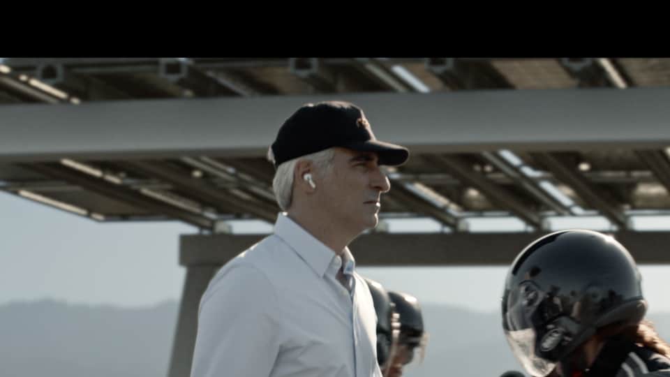
But there’s an important matter that needs clarification. Federighi immediately cleared the air on speculation that’s been rife on social media, that the roof of the Apple Park campus, also hosts a Formula 1 track. The keynote media, which promoted the upcoming F1: The Movie with Federighi driving a race car on the roof (with Tim Cook as team principal), complaining that he needed to save his tires. “What for?” enquired Cook. “I don’t know, that’s just what they say,” Federighi shot back.
Is there really a racetrack on the roof? “I hate to admit this, but I wouldn’t know,” laughs Federighi. More than anything else, the smallest of hopes for Lewis Hamilton fans, that Federighi takes over technical duties to fix Ferrari’s 2025 challenger, gone instantly. Back to Liquid Glass, for now.
HT asked Federighi about how much latitude app developers will have in terms of customising the available elements to best suit their apps, and whether these design guidelines will be consistent across all platforms developers make apps for.
“We offer a set of APIs with standardised controls. You get default behaviours. If you are using those, you get what we think is a delightful experience. We offer many different variants of the glass. You will have different levels of sort of pure clear glass, more opaque glass. We allow tinting the glass. Sometimes you want to bring the colour into the glass to indicate maybe something is an important operation. We’re giving people a bunch of tools to work within the world of glass,” Federighi tells us.
“You may also decide that in your interface that the vibe of the content is mostly dark. You can drive the adaptive glass to be really dark and it will tend to keep that colour. We give a lot of knobs to the individual app designer to apply this versatile material in a way that makes sense for their applications,” adds Federighi.
For, and as the Liquid Glass name suggests, the glass-like design elements and how well they are dialled in, will be crucial to the success of iOS 26 when it rolls out later this year. Between now and then, there will be multiple layers of optimisation (don’t let the social media commentary, based on beta versions, sway you either way), to fix text legibility, how the light and dark mode works with different app icons and fixing levels of transparency even within elements of iOS.
Federighi and Dye insist that the inspiration for the Liquid Glass design language comes from the VisionOS, but there was much less in terms of room for failure, since iOS, iPadOS, macOS and watchOS impact a lot more users, either way.
“One of our goals here was that we consider it such a privilege to design for 2.4 billion users of our products. And so we understand that the cost of change is quite high. If we are going to make a change, we want it to be one that we feel really good about. One of the goals we had with the redesign from the onset was that we wanted to kind of keep a lot of patterns that we’ve created over the years familiar. We wanted people to be able to pick this up and have it feel very familiar to them and to, in terms of how they’re currently using the product. And this is the hardest part,” points out Dye.
“We really also wanted it to feel very new and fresh. We had to take all these amazing technologies and level up the experience of using this product. Vision Pro is hard to translate into 2D video, but we think when you’re using it, you really feel that lovely interaction every moment,” Dye adds.
They were asked about the brief that got Apple’s design team to begin working on a visual overhaul of this magnitude, Dye insists “we don’t really have briefs”.
“I will say we’re constantly prototyping, constantly making, exploring design and oftentimes what happens is through the course of our conversations, we’ll come up with a prototype or a design or a reference of some sort and we will share that with the team. Then we’ll all get around and look at it and say that seems like something we’ve got to go after. In this case, it was the glass. And I think there’s always this moment when we say we don’t quite know how we’re going to do it and this seems like it’s going to be a real challenge, especially knowing the sort of demands of an operating system. But I think we all kind of get bought in on going after this challenge,” he says.
How important would it be for Apple to lock in the tactile feel and also how the elements engage with content on the screen, before iOS 26 rolls out with the new design language later this year. As does iPadOS 26, macOS 26 Tahoe and watchOS 26, alongside the tvOS 26 too. That indicates the width of changes that the company has worked on, and bringing so many devices into the same fold. More to that point, the iOS 26 update will be available for the second generation iPhone SE and newer devices — the iPhone SE was released in 2020.
“We spent a lot of time thinking about how do we create a digital material that can live in the real world with Vision Pro. So, we’ve been studying glass digitally for quite some time. That brought us to where we’re at now, where we wanted to expand that into the rest of our products and our ecosystem. For us, we’re lucky enough to have one studio where we’re working on hardware and software together,” Federighi points out.
“We’re actually making things out of glass to see how the refraction will work and how the reflections would work and how it would work over light or dark. It is about constantly going between the real world and the digital world. But of course, what gets us so excited about the work that we do is that we can benefit from — how this material could really adapt and change in real time depending on its context and circumstances,” he adds.
Liquid Glass adapts dynamically to backgrounds and content in real-time, and Apple insists it is the very qualities of glass that allow for a sort of fluidity that depends on the content or context. Dye hopes it lays the foundation for new experiences in the future. “Ultimately, it makes even the simplest of interactions more fun and magical,” he hopes.