E-Paper



Understanding AQI, and if it precisely depicts worst days
AQI is calculated by a predefined formula on the concentrations of different pollutants and then condensing the result to a single number.

 Prefer HTon Google


PM2.5 (particles of diameter 2.5 micrometres or less) concentration for 24 hours ending 4pm on November 18 was 549.6 microgram per cubic metre (µg/m3) and 676 µg/m3 at Jawaharlal Nehru Stadium and Najafgarh stations in Delhi respectively. The Air Quality Index (AQI) in both peaked at 500.

This raises an interesting question. How good an indicator is AQI when it comes to measuring pollution?
The short answer is that it shows a diminishing return because it is designed to capture health risks (and policy response) rather than measure pollution. Because the health emergency peaks at a given level of pollution, the index has an upper bound.
For the long answer, read on.
AQI is an index meant to represent pollution, but is not the actual level of pollutants in the air. “Air Quality Index is a tool for effective communication of air quality status to people in terms, which are easy to understand. It transforms complex air quality data of various pollutants into a single number (index value), nomenclature and colour,” the Central Pollution Control Board (CPCB) says.
As can be expected from CPCB’s description, AQI is calculated by a predefined formula on the concentrations of different pollutants and then condensing the result to a single number. The first part of this calculation – maths on concentrations of different pollutants – gives subindices of AQI for different kinds of pollutants. The second part – condensing subindices to one number – is relatively simple. The highest subindex is declared the AQI for an air monitoring station. As expected, it is the first part that leads to AQI moving slowly for higher concentrations and then hitting a peak.
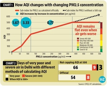
How does calculating subindices underestimate deterioration in air? This can be understood from the accompanying chart, which is a graphical translation of CPCB’s formula for converting PM2.5 concentrations into its subindex, which also ends up being the AQI for Delhi on most days. (See Chart 1)
As the chart shows, for PM2.5 concentrations up to 60 microgram per cubic metre (µg/m3), AQI increases by 1.67 for every 1µg/m3 increase in PM2.5 concentration. This happens in the AQI range of 0-100 or the good and satisfactory categories. For PM2.5 concentrations in the 60-120µg/m3 range, the subindex moves at double the speed (3.33 units for every 1µg/m3 increase in concentration), highlighting deteriorating air. This happens in the AQI range of 101-300 or the moderately polluted (101-200) and poor (201-300) categories. However, beyond concentrations of 120µg/m3, or in the very poor and severe categories, PM2.5 subindex plateaus, increasing only 0.77 units for 1µg/m3 increase in concentration. When PM2.5 concentration reaches 380 µg/m3 or an AQI of 500, it comes to a stop -- a further increase does not budge the needle.
The flatlining of the AQI at 500 is one reason why Delhi’s AQI on November 18 was only 494. Fifteen stations hit their maximum value , while other stations had an AQI somewhat below 500, giving an average somewhat below 500. To illustrate the difference such a cap at 500 makes, HT recalculated the AQI for all days of 2024 up to November 18 without the cap. Some criteria we used were same as CPCB’s, such as using stations that have at least 16 hours of data and the average was calculated for the 24-hour period ending at 4pm. However, stations that did not have data have for at least three pollutants were included ( CPCB excludes them). This analysis showed that the number of days of severe quality thus far in 2024 were 12 instead of eight and very poor days were 66 instead of 54. Moreover, three of the 12 severe AQI days identified in HT’s analysis (January 14, November 13, and November 18) had an AQI above 500. To be sure, January 14 and November 13 had an average AQI just marginally above 500 (506 and 503, respectively). It is only on November 18 that this number was much higher at 653. (See Chart 2)
Does this analysis mean that the official AQI is meaningless? Not really. CPCB’s report detailing the construction of India’s AQI says that the specific purpose of AQI is not just effective communication, but effective communication on health hazards. For example, the limit of the good category for PM2.5 is at the halfway mark of its national standard of 60µg/m3 and the satisfactory category ends at 60 µg/m3. The reason for a plateau in AQI at higher concentrations also has a reason. “As per HEI Global Burden of disease report (2013), till 90µg/m3 the relative risk of Ischemic Heart Disease increase and then more or less it plateaus off, therefore the next break point for category moderate is kept as 90μg/m3,” CPCB’s document says. Given the fact that AQI levels are linked with Graded Response Action Plan (GRAP) to pollution, AQI levels are also meant to inform policy.
This means that while the construction of the AQI might be meaningful, the use of AQI as a measure of air pollution has its downsides. In places such as Delhi, where there are just a few months worth of good and satisfactory days, fast deteriorating air will appear to deteriorate slowly because AQI moves slowly in the very poor and severe range. That is why AQI – as it exists – fails to convey the sense of alarm in Delhi. To be sure, one could also say that the bigger failure is the absence of a proactive policy to prevent pollution for not just Delhi but the entire northern plains.