
 E-Paper



Give me a sign: How designers make logos and brands sparkle

 Prefer HTon Google


There’s room for more than one serif in town these days. Typographers are reworking old logos and giving startups a new look. See how every letter matters
Back in June, Spotify announced that it was redesigning its logo and releasing a new font to upgrade its visual identity. The new typeface, Spotify Mix, aimed to keep up with the “dynamic and evolving nature of audio culture,” said the company.
Users didn’t think so. Most people hadn’t paid attention to the font before – it was only when it was changed that a sense of unease crept in. They flooded social media with complaints almost immediately, about both the logo and the font. “That’s the power of typography,” explains Anand Naorem, the co-founder and creative director of Indian typeface design company Altertype. “Every second of our lives, we’re interacting with text, whether we realise it or not.”
Here’s how design firms are creating memorable logos and lettering that stand out from the crowd.
Sign and language
It used to be that the logo – like in the case of Axis Bank, Asian Paints, and Star TV– came first, and the typeface later. Now, it’s all done together to look more cohesive. It also involves more than picking out a cute logo, typeface and palette. In a world where a brand’s visual identity is competing with industry rivals and every icon on our phone screen, even fonts are customised.
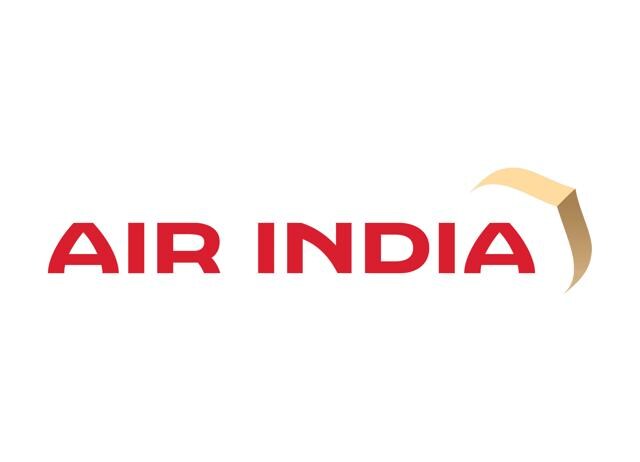
Air India unveiled its new logo in August last year, along with a custom font, called Air India Sans, in a major rebranding move. The new signage had to work not just on the company headquarters in Mumbai and the tails of its aircraft, but on their app, website and inflight safety leaflets too. It had to look both practical and pretty – why risk a crash over illegible text? The rebranding, executed by London-based design firm FutureBrand, cost ₹40 crore for the fleet of planes alone.
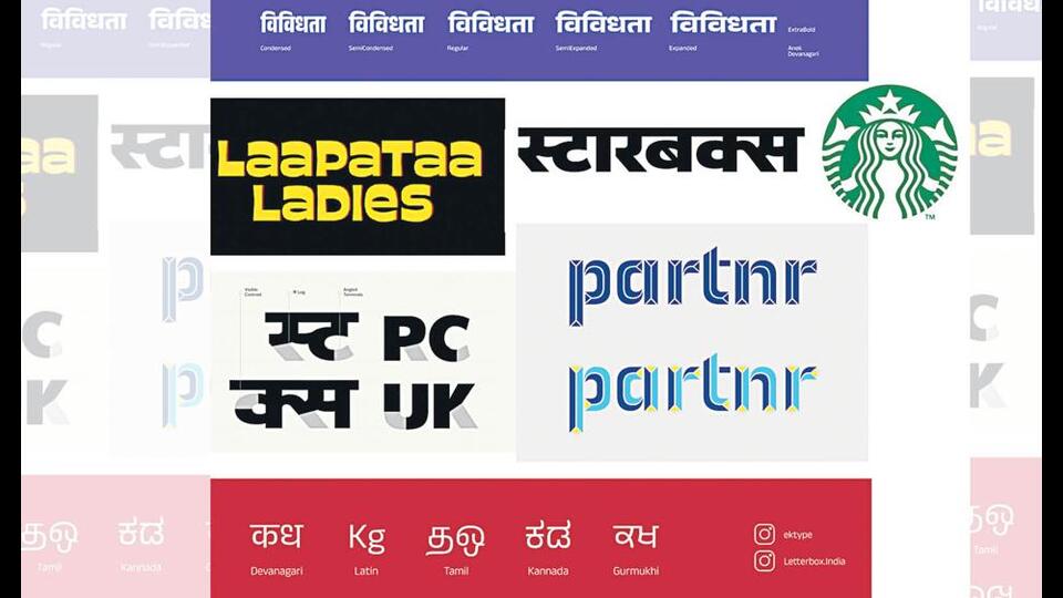
At Altertype, Naorem’s team works handles branding across all formats. If they’re designing a logo, they ensure that it can be adapted into a font later on. They recently worked with the automotive spare parts company PARTNR, and built the brand identity around Indian street typography – signboards, street art, and truck art – to appeal to mechanics and truck drivers.
Solo ergo logo
Logo design isn’t restricted to companies and brands. Mumbai’s Ek Type designed the lettering for this year’s breakout indie hit Laapataa Ladies. The film’s director Kiran Rao asked Ek Type co-founder Sarang Kulkarni to design the logo in English, Hindi, and Urdu. They created chunky yellow lettering to echo the playful, quirky tone of the movie.
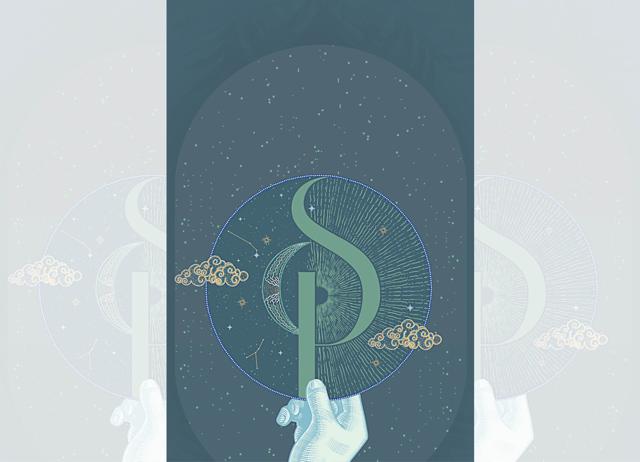
Customised typefaces are at luxury weddings too. Itchha Talreja, who runs her own design company, says that her clients look for lettering that symbolises the theme of their celebrations. So, she creates monograms bearing the couples’ initials and puts them on the wedding invites, stationery and other decorations. For a recent wedding held in Budapest, she created a logo that featured the yin and yang, with the sun, stars, and moon. The sun symbolised good vibes, the moon represented growth and balanced out the stars – all attributes that the couple believed described their relationship.
By the letter
Visual branding has also come a long way in the last decade. Foreign companies looking to make their name in India used to default to cheesy Roman-Devanagari hybrid lettering. Now, the connection is lighter, smarter. Shiva Nallaperumal, co-founder of Mumbai’s November Design, worked on the humanist typeface for PhonePe in 2019, which went across all their platforms, including the advertisements they used on billboards.
Naorem says that some projects call for specialists – linguists, scholars and type designers. He worked on a project to document and preserve Ol Chiki, the script for the Santhali language spoken in West Bengal, Jharkhand, and Odisha. “We spent months making video interviews of Santhali speakers, and looked at schoolbooks to see how kids were writing it,” he recalls. Close to 15 designers worked on the family of scripts. The project won the Red Dot Design award last year.
Kulkarni’s Ek Type also standardises old scripts so they can be digitised. They recently worked on Ranjana, a Nepali script that originated in the 11th century. “Dr Murali Prahalad, the CEO of technology company Iridia, was looking to digitise some manuscripts,” he says. “We collaborated with a Nepal-based language and script expert, Ananda Maharjan, and put in 18 months of work researching and developing the font.” The font is now available on the developer platform GitHub.
Trending today
Smaller brands, F&B outlets, and creative companies want minimalist, digital-friendly logos. They prefer handwritten font families. Older, bigger brands tend to stick to neutral themes. “Louder, more experimental typefaces from the 1970’s and 1980’s are slowly becoming popular again,” finds Nallaperumal.
And local laws and politics keep everyone busy. Satya Rajpurohit’s Indian Type Foundry has been transliterating logos into Indian languages since 2009. “In states such as Karnataka and Maharashtra, bilingual signage is mandatory. So, brands must reimagine their shopfront signage in the local language while maintaining the overall characteristics of their logo.” The firm redesigned the Starbucks logo in Kannada or Marathi, keeping the same light simple look. What they can’t do, is get every server to write your name correctly.
From HT Brunch, August 24, 2024
Follow us on www.instagram.com/htbrunch


