
 E-Paper



How to choose the right colours to make your home feel warm, cosy and effortlessly elegant
Wall colours, just like lighting, can influence how your home looks and feels. If you want a warmer, cosier space, here’s how to choose the right shades.

 Prefer HTon Google


Wall paint can shape how a room looks and feels. While bold shades can make a space feel energetic, and social media trends may push maximalist or minimalist styles, they may not suit everyone. If you prefer a home that feels warm and cosy, choosing the right wall colours can help you create that look while saving both time and money.
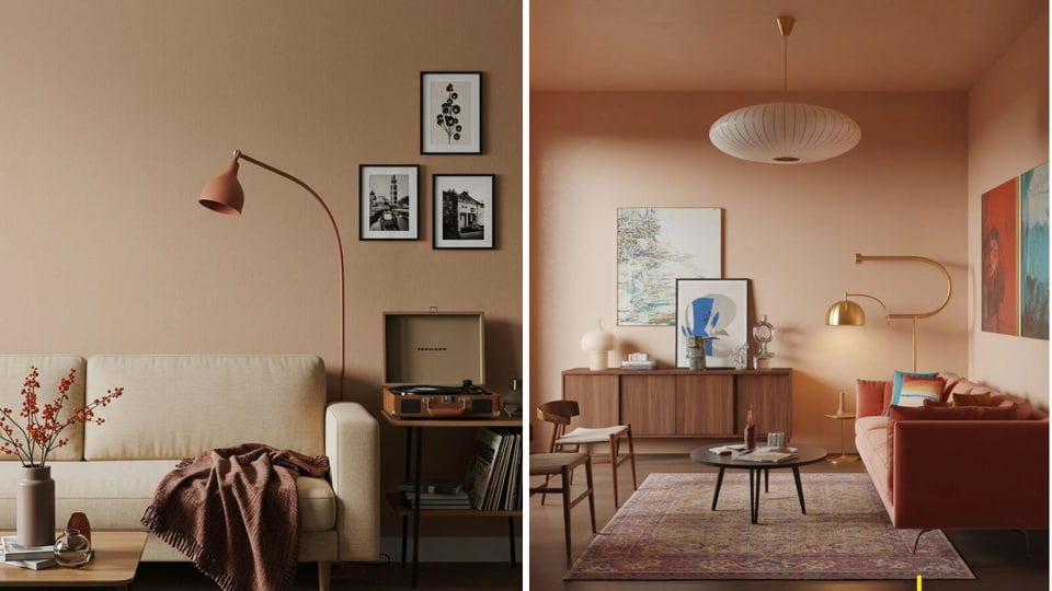

However, creating a warm and elegant home does not necessarily mean filling it with dark or heavy shades. According to Priyanka Sinha, Founder, The Opulence Interior Design Studio, the overall feel of a room comes from how colour works with natural and artificial light, furniture, finishes and textures.
“Trend colour schemes will come and go, but colours that give a feeling of classic warmth and elegance will always create a comfortable, cohesive space,” says Sinha. Here are some ways to choose and layer colours to create a home that feels warm, sophisticated and personal.
Start with the feeling you want to create
Instead of choosing a colour first, think about how you want the room to feel. The purpose of the space can help determine the direction of the colour palette. For instance, a bedroom may benefit from soft, calming hues that create a restful atmosphere, while a lounge or living room can accommodate warmer and more vibrant shades. Earth-inspired colours can also work well in dining areas, where they can create a welcoming and grounded setting. “Start with mood, not colour,” says Sinha. Defining the desired atmosphere first makes it easier to develop a harmonious colour scheme rather than selecting individual shades without considering how they work together.
Build the palette around warm neutrals
Warm neutrals can form the foundation of an elegant interior without making the space feel overwhelming. Shades such as beige, cream, taupe, warm white and soft brown can create a welcoming backdrop while allowing furniture, artwork and accessories to stand out. A warm neutral palette can also provide flexibility when introducing other colours. Rather than matching every element exactly, homeowners can use textiles, artwork or decorative objects to introduce additional shades. For those who prefer a more traditional approach, these neutrals can also be combined with classic colours to create a more defined palette in their home decor.
Bring in earth-inspired shades
Nature-inspired colours can add warmth and character without making an interior appear overly dramatic. Terracotta, olive, muted greens, clay, caramel and earthy browns are some options that can be incorporated into a warm colour scheme. These shades work particularly well with natural materials. Wood, stone, linen and woven textures can complement earthy colours while adding another layer of visual interest. Rather than introducing several saturated colours at once, Sinha suggests choosing one or two earth-inspired shades and using them as accents. They can appear through cushions, rugs, curtains, artwork or smaller decorative elements.
Consider both natural and artificial light
The same colour can look noticeably different depending on the lighting in a room. A shade that appears soft and warm in natural daylight may look deeper or different under artificial lighting in the evening. Therefore, colour samples should be observed at different times of the day before making a final decision. Consider how much sunlight enters the room, the direction and placement of windows, and the type of artificial lighting being used. “Lighting is not an optional addition. It is part of the colour story,” says Sinha. Instead of treating lighting as something that is added after the colour has been selected, homeowners can consider both together. Warm lighting, for example, can enhance the cosy quality of an already warm palette.
Use contrast carefully
An elegant interior does not have to be completely monochromatic. Carefully introduced contrast can prevent a room from appearing flat and can help highlight specific elements. A pale warm-beige wall, for example, can be paired with dark wood furniture. Similarly, muted green can be balanced with cream upholstery. Small touches of black through lighting fixtures, handles or accessories can also provide definition. Select a dominant colour palette and use contrasting shades selectively to create focus in your home interior design.
Let materials add colour too
Colour in an interior does not only come from painted walls. Furniture, flooring, artwork, rugs, curtains, accessories, and wood finishes all contribute to the overall palette. Natural wood, for instance, can introduce warmth without adding a strong or saturated colour. Similarly, a patterned fabric can create variation while staying within the same colour family. Layering similar shades through different materials can also make a room feel richer. A combination of linen, wood, woven fabrics and stone in related neutral or earthy tones can create depth without relying on multiple bright colours.
Balance colour with texture
A warm colour palette becomes more interesting when different textures are introduced alongside it. Using the same or similar colour across several materials can prevent the space from feeling repetitive. For example, beige can appear through a linen curtain, textured upholstery, a rug and a ceramic accessory. Although the colour remains within the same family, the differences in texture give each element a distinct visual quality. This approach can be particularly useful for homeowners who prefer understated interiors but still want the room to feel layered and sophisticated.
Don't let trends dictate the entire palette
Colour trends can be useful sources of inspiration, but they do not necessarily have to determine the colour scheme of an entire home. The most important consideration is whether the colours work for the people living in the space. A trendy shade can be introduced through smaller, replaceable elements such as cushions, artwork or accessories rather than being used on permanent surfaces. “Your colour choices at the end of the day should reflect those who will be occupying your home,” says Sinha. A home that combines colour, light, texture, furniture and personal accessories in a balanced way can feel both considered and lived-in.
Create a cohesive colour story across the home
Each room does not have to use exactly the same colours. However, carrying a few recurring tones or materials from one space to another can help create continuity. For example, warm beige may serve as the base in the living room, while olive serves as an accent. The same wood tone or olive accent can then be carried into the dining room or bedroom through smaller elements. This creates a visual connection between rooms without making the entire home look identical.
Make the colour palette personal
Ultimately, the right colour palette is one that suits the needs and lifestyle of the people in the home. Personal objects, artwork, photographs, heirlooms, and collected accessories can all introduce colours that become part of the home interior. Rather than trying to create a perfectly styled space based entirely on social media trends, homeowners can use their existing belongings as a starting point and build the colour scheme around them. A warm and elegant home is therefore less about selecting one “perfect” colour and more about creating balance between shades, materials, textures, furniture and lighting. When these elements work together, colour can do more than simply decorate a room. It can help create a space that feels comfortable, welcoming and reflective of the people who live there.
Frequently Asked Questions

Disclaimer: At Hindustan Times, we help you stay up-to-date with the latest trends and products. Hindustan Times has an affiliate partnership, so we may get a part of the revenue when you make a purchase. We shall not be liable for any claim under applicable laws, including but not limited to the Consumer Protection Act, 2019, with respect to the products. The products listed in this article are in no particular order of priority.


