
 E-Paper



Too many colours in your home? 5 easy ways to fix unbalanced interior colour palette

 Prefer HTon Google


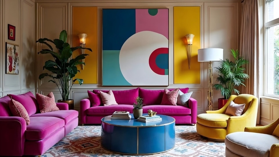
If your interiors are looking tacky because of the number of colours you have added, learn how to correctly incorporate them.
A good splash of colour in interiors is always desirable; it feels fun, quirky, and full of eclectic energy. Among the many hyper-colourful trends, dopamine decor grabbed a lot of attention. It is rooted in the idea where bold and bright colours take the centre stage to create lively, mood-enhancing spaces.
ALSO READ: Living room looking dull? 3 easy hacks to upgrade your space and impress guests
At the very heart of any colourful style is the charm of whimsical playfulness, because colours have the innate power to narrate an entire story in shades and hues. The ones which are bright infuse a sense of electric and amped-up energy. Such vivid palettes extend into other decor styles, besides the obvious dopamine decor. Some include maximalism, pattern drenching, and art deco.
Personal expressions like kidulting, also embrace hyper-colourful aesthetics, as they are grounded in the idea of moving through life with a childlike playfulness and curiosity.
But there's a fine line between something looking raucous and resplendent. Colours need to be used with intention and palette carefully balanced, otherwise the space can feel discordant and cluttered. The very shades meant to lift your mood can end up being counterproductive, making the spaces appear ‘excessive.’
We asked Riya Garg - founder and principal designer at Rya Interiors, on how to fix the problem of colourful decor looking overwhelming, and she agreed it comes down to ‘excess’.
The designer observed that many homeowners are in the habit of adding too many colours that don't go well together. “Home should feel intentional. But walk into many living spaces today and what you encounter is visual noise, an accent wall that fights the sofa, cushions in four competing hues, artwork that belongs in an entirely different story.”
Visual noise happens when you are overstimulated,as too many elements compete for your attention, and your eyes soon begin to tire, unsure of where to focus. In the end, the room certainly feels chaotic to the senses, rather than following the basic tenet of interior styling: cohesion. And colour can easily be the tool to achieve this. But the designer reminded colours, despite being one of the powerful tools in interior design, are also frequently misused.
Riya shared that fixing an unbalanced palette is one of the easiest ways to tackle this problem. She offered these practical hacks to bring harmony back to your home:
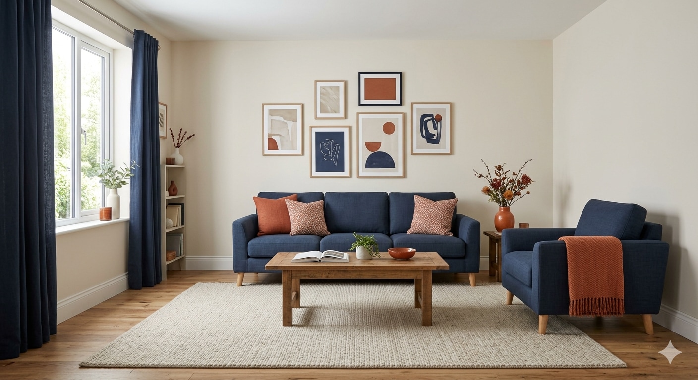
1. Apply the 60-30-10 Rule
- Sixty percent of a room should be the dominant colour, typically the walls or a large rug.
- Thirty per cent goes to secondary colour seen in upholstery, curtains and larger furniture.
- The remaining ten per cent is accent: cushions, vases, small décor.
- If your room feels chaotic, the accent colours have likely taken over territory that isn’t theirs.
2. Commit to undertones
- Every colour carries an undertone, either warm (yellow, red, peach) or cool (blue, green, grey).
- When undertones clash, a space feels off even.
- Lay paint chips, fabrics and flooring samples side by side in natural light. Choose a side and edit accordingly.
3. Build a colour story, not a collection
- Limit to a maximum of three colours, excluding neutrals, and give each a clear role: grounding, lifting or accenting.
- Every colour in the room should feel deliberately invited, not just individually beautiful, but collectively coherent.
4. Use repetition to create flow
- Echo one colour in at least three places across the room: a cushion, a candle, a framed print.
- This technique, known as colour threading, creates a visual rhythm that makes even a bold palette feel considered.
5. Let neutrals do most of the work
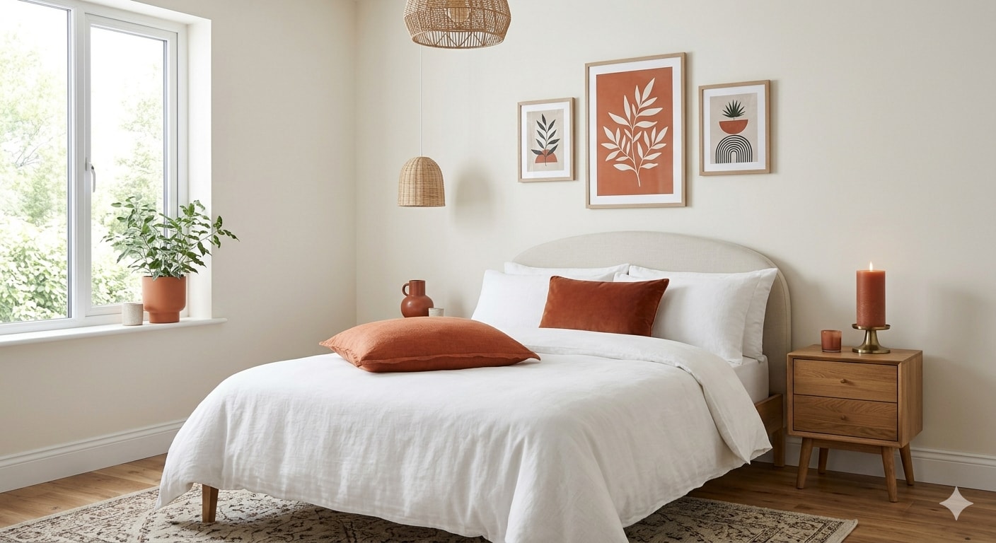
- Neutrals like off-white, warm grey, linen, raw wood do the heavy lifting.
- Neutrals are not the absence of design decisions; they’re often the most powerful ones.
- Introduce them as buffers between stronger colours and watch the room exhale.
In the end, no one is telling you to swear off colours. But don't stuff colours in just because you have the free will to do so. The result won't be easy on the eyes. Instead, be intentional with your choices and colour pairings.


